Gerber-Green-Imai replication
Do get-out-the-vote initiatives increase voter turnout? Gerber and Green (2000) set out to measure the effectiveness of different interventions: phone calls, mailers, door to door canvassing, and no intervention. They found that in person canvassing substantially increased turnout, direct mail slightly increased it, and phone calls reduced it. The finding was extreme: in single-voter households, they estimated that phone calls reduce turnout by 27 percentage points. This result called into question the millions of dollars and hours spent on telephone canvassing for elections.
Imai (2005) showed that the randomization in the field experiment did not go according to plan: the randomization of the phone canvassing treatment was implemented incorrectly, resulting in selection bias. Those who received phone calls with a message about how close the electoral race would be were 10 percentage points more likely to answer the phone than those who received phone calls with a message about civic duty. Because of this, we can’t determine whether differences in voter turnout between the two groups is due to the different phone messages or due to characteristics of who answered the calls.
The dataset here only includes controls and people who received the phone treatment, AND actually answered the phone. It does not include those who were called but did not answer, and it does not include those who received mail or in-person treatment.
Propensity score distributions
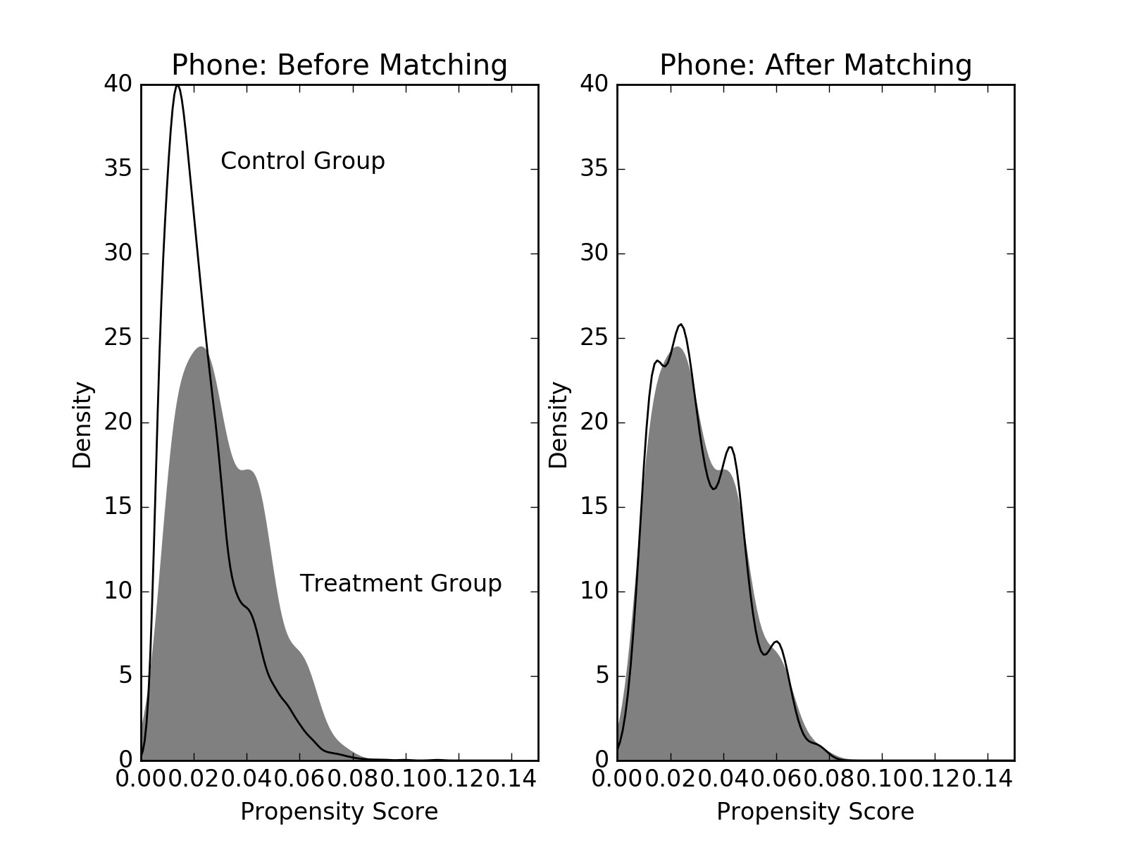
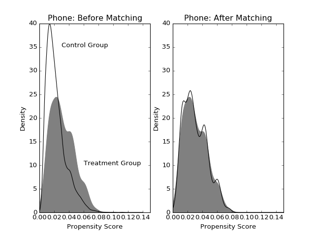
Imai applied propensity score matching to correct for the covariate imbalances due to incomplete randomization in Gerber and Green’s experiment. For the phone intervention, he matched 5 controls, with replacement, to each treated unit. Imai ended up with 1,210 selected controls. We find 858. This difference could be due to small differences in the propensity score estimates.
from pscore_match.data import gerber_green_imai
from pscore_match.pscore import PropensityScore
from pscore_match.match import Match, whichMatched
from scipy.stats import gaussian_kde
import matplotlib.pyplot as plt
import numpy as np
import pandas as pd

imai = gerber_green_imai()

# Create interaction terms
imai['PERSONS1_VOTE961'] = (imai.PERSONS==1)*imai.VOTE961
imai['PERSONS1_NEW'] = (imai.PERSONS==1)*imai.NEW
treatment = np.array(imai.PHNC1)
cov_list = ['PERSONS', 'VOTE961', 'NEW', 'MAJORPTY', 'AGE', 'WARD', 'AGE2',
                            'PERSONS1_VOTE961', 'PERSONS1_NEW']
covariates = imai[cov_list]
pscore = PropensityScore(treatment, covariates).compute()

pairs = Match(treatment, pscore)
pairs.create(method='many-to-one', many_method='knn', k=5, replace=True)
data_matched = whichMatched(pairs, pd.DataFrame({'pscore': pscore, 'treatment' :treatment, 'voted':imai.VOTED98}))
Let’s see how the covariate imbalance improves after matching. If there is good covariate balance, the treatment and control group distributions of propensity scores should overlap. The gray smoothed density represents the treatment group and the black line represents controls. Before matching, there are a large number of controls with smaller probability of getting called; after matching, we have a group of controls whose propensity scores match those in the treatment group. Compare this to Figure 2 in Imai’s paper.
(Source code, png, hires.png, pdf)
Covariate balance tests
By definition, propensity score matching helps improve the overlap of the treatment and control group propensity score distributions. But does our estimated propensity score help improve the overlap of covariate distributions?
We can check this visually, the same way as we did with the propensity score distributions before and after matching, or we can look at many covariates at once by running statistical tests. For each covariate we want to balance, we can run a two-sample test to compare the distributions for the treatment and control groups. We do this before matching and again after matching, instead comparing the treatment group with the matched controls. We hope to see that the matched controls are similar to the treated group on all these covariates.
Important note: I don’t “believe” the p-values coming out of these tests, in the sense that the necessary assumptions are definitely violated. However, they can serve as a crude measure of how similar the treatment and control group distributions are. A “small” p-value suggests that they’re very different.
Ideally, we’d want to iterate this process of estimating propensity scores and testing covariate balance until we deem them to be sufficiently balanced. Here, I just used the propensity score model specification that Imai provided; I assume he already tried to optimize for balance.
We ran both a t-test and a Wilcoxon rank sum test for each covariate in the propensity score model. As we can see, covariate imbalance improved for everything except number of people in the household (PERSONS), which had decent balance to begin with. The matching worked.
import plotly
pairs.plot_balance(covariates, filename='ggi-balance', auto_open=False)
Estimated treatment effects
Now, let’s compare the estimated average treatment effect on the treated (ATT) before and after matching. We can’t compare directly with Gerber and Green or Imai, because we don’t have the data on noncompliers (those who didn’t answer the phone). Their estimates account for the noncompliance rate. However, our post-matching estimate (7.2%) is close to what Imai reports (6.5%).
treated_turnout = imai.VOTED98[treatment == 1].mean()
control_turnout = imai.VOTED98[treatment==0].mean()
matched_control_turnout = data_matched.voted[data_matched.treatment==0].mean()
ATT = treated_turnout - control_turnout
matched_ATT = treated_turnout - matched_control_turnout
print(str("ATT: " + str(ATT)))
print(str("ATT after matching: " + str(matched_ATT)))
ATT: 0.203528335107
ATT after matching: 0.0720647773279